Trading patterns are at the core of many decisions that day traders make. Most swing and day trading strategies take advantage of pattern movements. They can be the sign of a potentially profitable trade. In fact, this is how most traders find their trades. This is because, in most cases, price in financial markets generally repeat certain movements.
There are many popular trading chart patterns, in this article we’ll look at each of them and what they tell a trader. This article will discuss candlestick trading graph patterns for day trading, swing trading, and even long-term investing.
Table of Contents – 14 Trading Chart Patterns For Day Traders
What Are Trading Patterns?
To understand what basic trading patterns are and how they form, you first need to know how to read candlestick charts. The most common form of chart used by day traders are candlestick charts. In this article I will use candlestick charts for all examples of basic trading graph patterns.
A trading chart provides information about the price of a given asset. A chart will show you the movement of price over time. Candlestick chart analysis will show where price opens, closes, and the high and low point it reached.
Trading patterns are a common shape or combination of lines formed when tracing price movements.
How Do Resistance and Support Lines Work?
Understanding resistance and support lines is key to interpreting any chart pattern. In simple terms, these are the “ceilings” and “floors” of a price chart that help traders anticipate where price movements might pause or reverse.
Resistance lines are drawn by connecting previous highs on a chart. Imagine them as barriers the price struggles to push above. The more times the price has touched a resistance level and failed to break through, the more significant that line becomes—especially if you’re looking at larger timeframes such as daily or weekly charts. Resistance doesn’t always sit flat; it can slope upward or downward as a trendline, linking a series of higher highs or lower highs.
On the flip side, support lines are created by joining previous lows. Think of them as a sturdy floor that price rarely falls below. As with resistance, the strength of a support line grows every time the price touches it and bounces back up. Support can also appear as a trendline, connecting lower lows or higher lows depending on the trend.
What’s worth noting is that these levels aren’t always drawn identically by every trader—there’s a bit of art to this science. Yet, there’s a widely-accepted principle in technical analysis: once a resistance line in an uptrend is broken, it often flips roles and becomes a new support. Likewise, when a support line in a downtrend is breached, it frequently acts as future resistance.
Together, these lines form the foundation of many chart patterns and offer clues to potential price direction.
Challenges Novice Traders Face in Spotting Chart Patterns
New traders often face hurdles when trying to identify chart patterns on candlestick charts. For starters, price movements in real-time rarely create perfect or textbook examples of patterns—think less “picture in the manual” and more “abstract art project.” This can make it tough to be confident in what you’re seeing.
On top of that, market conditions are always changing. Volatility, market sentiment, and news events can all warp how patterns form, making previously reliable shapes suddenly seem unfamiliar. Throw in multiple time frames and trading different assets—like stocks, forex, or commodities—and you’ll see that a pattern on one chart might look completely different on another.
If you’re just beginning, it’s easy to get caught up in the noise or second-guess yourself. However, with practice and the right education, spotting these patterns gets easier, helping you make more informed trading decisions.
Why Does Candlestick Pattern Analysis Work?
There are two methods to picking a trade; fundamental analysis, and technical analysis. Fundamental analysis will create a hypothesis based on economic factors. Technical analysis will create a hypothesis based on trading chart data and sentiment. An example of this would be popular trading patterns.
So why does candlestick pattern analysis work to find potentially profitable trading patterns? Because many traders are looking for the same patterns. A long time ago, traders realised that patterns repeat with similar statistical properties. So in recognising these trading patterns, a trader can predict the more likely direction.
Price moves depending on whether there are more buyers than sellers, or more sellers than buyers. So if clean trading patterns form, there will likely be an increased interest in trading in a more probable direction. This tips the balance of buyers and sellers and the pattern fulfils its indicated direction more often than not.
How Market Conditions, Time Frames, and Assets Shape Chart Pattern Reliability
It’s important to remember that chart patterns don’t exist in a vacuum. The reliability of a pattern can change depending on market conditions, the time frame you’re trading, and the specific asset in question.
Let’s break this down a little:
- Market Conditions: Chart patterns tend to be more dependable when markets are trending cleanly—think of a strong bull or bear run like we’ve seen in the S&P 500 or the ASX200 during sustained rallies or selloffs. In choppy, sideways markets, even classic patterns like the head and shoulders or double tops can produce more false signals.
Time Frames: A pattern spotted on a higher time frame, such as a daily or weekly chart, typically holds more weight than one found on a 1-minute or 5-minute chart. Shorter time frames can be noisier—full of minor fluctuations and fakeouts in trading, while longer charts help reveal the bigger picture that institutional traders (think BlackRock or Vanguard) often pay attention to.
Different Assets: Each asset class has its own quirks. For example, forex pairs like EUR/USD often see more respect for support and resistance levels due to their high liquidity. Conversely, smaller-cap stocks on the ASX or NASDAQ can behave erratically after news, making patterns less reliable. Commodities and futures contracts, from oil to gold, can react sharply to external catalysts, so patterns might resolve quicker than expected.
In practice, experienced traders always factor in market environment and asset personality when they interpret a pattern. That’s why it pays to practise recognising patterns across different scenarios—you’ll get better at filtering noise from signal and picking the moments when a pattern is truly worth trading.
Key Chart Patterns and What They Reveal About Market Sentiment
When it comes to reading candlestick charts, it’s not just about memorizing shapes—it’s about recognizing the psychology that drives them. Let’s unpack a few of the most significant chart patterns and the clues they offer about who’s in charge: the bulls or the bears.
Double Top
The double top is a classic sign of market exhaustion after a run up in price. Imagine the price climbing, hitting a ceiling (the first “top”), pulling back, and then making another attempt to break through that same resistance—only to fail again. This “M-shaped” pattern signals that buyers have tried—twice!—to rally higher, but sellers have drawn a clear line in the sand. The key components: two highs at roughly the same level, separated by a trough. The pattern is officially validated when the price breaks down below the intervening trough (also known as the neckline). Psychologically, it’s a move from bullish optimism to a growing bearish sentiment—the crowd recognizes resistance is just too strong.
Double Bottom
Flip the double top upside down and you get the double bottom, which is shaped like a “W.” Here, prices fall to a support level, bounce, retest that same floor, and then push upward. It’s the market’s way of showing that buyers are stepping in to defend a price zone—twice in a row. The critical pieces are two similar lows, separated by a minor rally. Once the price breaks above the peak between the lows (the neckline), the bulls start gaining the upper hand. Traders see this as confirmation that buyers are outweighing the sellers—confidence starts to build for a possible uptrend.
Ascending Triangle
The ascending triangle typically forms during an existing uptrend and is all about bullish pressure patiently building. Picture rising lows converging towards a horizontal resistance—think of it like water steadily rising against the dam. Buyers are willing to pay increasingly higher prices, while sellers hold firm at a known resistance. A breakout above this ceiling, especially on strong volume, suggests that buyers have finally overpowered sellers, and momentum can continue upward.
Descending Triangle
Here, sellers press their advantage, as the price forms lower highs against a flat support zone. Each time the buyers attempt to rally, they get turned away sooner. This “descending” setup often points to a bearish shift. The crucial element: price keeps testing support, with each bounce getting weaker. When support finally crumbles, the bears are in control, and a sharper down move is likely.
Symmetrical Triangle
This pattern is all about indecision and coiling energy. Both buyers and sellers are pushing back against each other, forming a cone-shaped triangle as highs get lower and lows get higher. The market is essentially compressing, and you’ll see trading volume drop as the range narrows. Eventually, though, the price will break out—sometimes in the direction of the previous trend, sometimes the opposite. Traders watch this pattern closely for the breakout, knowing that a burst of volatility is in the cards.
Rising Wedge
The rising wedge is a subtle warning sign—prices trend upward, but the peaks and troughs begin to converge. It often signals fading bullish enthusiasm. Think of buyers getting tired, and sellers gradually getting more aggressive. The psychology here is that, even as price “climbs,” the momentum is draining away. A break below the wedge’s lower boundary is often a hint that sellers are about to step in for real, and a decline may follow.
Falling Wedge
On the other hand, a falling wedge indicates that the downtrend’s momentum is waning. The lows become less dramatic, and the price action compresses. Buyers quietly gather strength, and the crowd starts anticipating a reversal. A breakout above the upper boundary suggests the sellers have finally lost control, paving the way for a bullish move.
Bullish Flag
After a sharp rally, price may take a breather—forming a small downward-sloping channel or rectangle. This is essentially the market catching its breath. Buyers are still in the driver’s seat, but short-term traders are taking profits and consolidating gains. Once price breaks out of the “flag,” it’s often a continuation of the strong uptrend, as new buyers pile in and moving averages catch up to price.
Each of these patterns tells a story about the struggle between buyers and sellers. The shapes aren’t just technical curiosities—they’re evidence of shifting psychology in the market. By recognizing them, traders can better anticipate when the crowd may be ready to change direction.
Types of Basic Trading Patterns
Note, before we start: If the type of trading that you do only allows buying, half of the patterns discussed won’t be available to you. You will be able to take advantage of bullish day trading patterns, but not the bearish trading chart patterns.
This is one of the reasons why we trade futures, it allows us to buy and sell. Because of this we have trading opportunities when the market goes up and also when it goes down.

Continuation Trading Patterns
A continuation chart pattern suggests that price will continue in the same direction after a high or low completes. A common continuation are simple ‘trends’ which follow highs and or lows in one direction. Common continuation trading chart patterns can also include triangles, pennants, and flags.
Bilateral Trading Patterns: Navigating Uncertainty
While continuation and reversal patterns tend to give us a clear nudge in one direction or another, there’s a third family to consider—bilateral trading patterns. These are the fence-sitters of the chart pattern world. Instead of signalling whether the price is likely to keep moving in the current direction or completely turn around, bilateral patterns simply announce: “A big move is coming, but we’re not telling which way!”
Bilateral patterns can appear in bullish, bearish, or even choppy, trendless markets. What sets them apart is their neutrality; they offer no bias until the market tips its hand. The most well-known example is the symmetrical triangle. Picture two trendlines converging—the resistance slopes down, the support slopes up—creating a tightening range, almost like a spring winding up.
Symmetrical Triangle: This pattern can break out up or down and generally forms when buyers and sellers are locked in a stalemate. The market is coiling, and energy is building up for a sharp move—think of watching a game where neither side has scored yet, but the action keeps speeding up as the clock counts down.
Here’s how bilateral patterns differ from the others:
- Continuation patterns (like bullish flags) suggest the current move will keep rolling after a pause.
- Reversal patterns (such as head and shoulders) hint that price may soon change course.
- Bilateral patterns, meanwhile, simply warn you that volatility is coming without picking a direction in advance.
If you’re trading bilateral patterns, patience is your friend. Rather than jumping the gun, it’s wise to wait for a convincing breakout before entering a trade—this can help avoid getting caught in a head fake if the pattern resolves unexpectedly.
Now that we’ve covered the different types of trading patterns, let’s jump into the specifics of bullish and bearish patterns that traders often watch for in the markets.
Reversal Trading Patterns
Reversal trading patterns are the opposite of a continuation pattern. A reversal is the sudden change in direction of price. These reversals often happen when price reaches either support or resistance.
Trading patterns are a part of the creation of these support and resistance levels. You will find reversals in patterns like ABC patterns, channels, amongst others.

What are Bullish Trading Chart Patterns?
When a trader is “bullish” on an asset they have a strong belief that price will go up. The same is true for market sentiment overall. That said, a bullish pattern is one that indicates that price may go up.
This may be due to a continuation via breaking a resistance level, or a reversal off of support.
What are Bearish Trading Patterns?
When a trader is “bearish” on an asset they have a strong belief that price will go down. Again, the same is true for market sentiment overall. That said, a bearish pattern is one that indicates that price will may go down. The patterns are common in many bear market trading strategies.
This may be due to a continuation via breaking a support level, or a reversal off of a resistance level.
Understanding Volatility and Gap Chart Patterns
Next up, let’s look at a less straightforward group: volatility and gap patterns. These patterns are more about indecision and sudden shifts in market mood than outright bullish or bearish signals.
Volatility patterns—such as broadening formations and island reversals—tend to show up when traders can’t quite agree on where price is headed. You’ll typically see price swings widen out, showing that buyers and sellers are battling it out. These patterns often signal that a reversal might be brewing, especially if the market has been trending steadily in one direction.
Gap patterns are another signpost worth watching. These form when price literally jumps, leaving a gap on the chart. There are a few types worth knowing:
- Breakaway gaps: These often kick off a new trend, appearing as price bursts away from a consolidation zone.
- Runaway (or continuation) gaps: These pop up in the middle of strong trends, suggesting that momentum is still strong.
- Exhaustion gaps: These typically show up near the end of a move, hinting that buyers or sellers may be running out of steam.
By learning to spot volatility and gap patterns, traders can get early clues about shifts in market sentiment—whether that’s uncertainty, enthusiasm, or an impending reversal.
Breakout Trading Patterns
I have put these two patterns in their own category as they are not bullish or bearish. The trading patterns below (Sideways channel and Symmetric Triangle) have no direct sentiment in forming.
These trading graph patterns create well established support and resistance levels. Because of this the breakout could occur in either direction. Once price breaks a level it tends to see a big move. This is when the pattern becomes either bullish or bearish.
Understanding Bull Traps and Bear Traps (False Breakouts)
In the world of breakout trading, it’s important to recognise that not every breakout tells the truth. Sometimes, what looks like price bursting free from a level of support or resistance is simply a ruse. This is where bull traps and bear traps come into play—classic pitfalls that can catch out even experienced traders.
A bear trap occurs when the price appears to break down below a support level, giving the impression that a downward move (a bearish trend) is underway. Sellers may jump in expecting further declines, but the market then quickly reverses direction, snapping back upwards. This traps those who sold, as the anticipated bearish move fails to materialise.
Conversely, a bull trap is the mirror image. Here, price pushes above a resistance line, luring eager buyers to enter, thinking a new rally is beginning. However, instead of continuing up, the price suddenly pivots and drops back down, catching the buyers on the wrong side of the trade.
These traps highlight the importance of waiting for confirmation before acting on any breakout. Many traders watch for extra clues—like a surge in volume or a retest of the breakout level—to avoid falling into these common market snares.
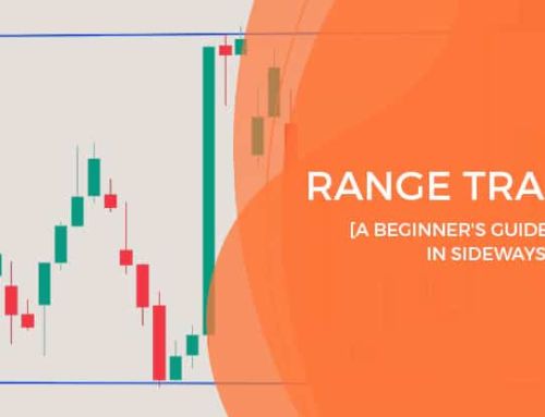
Sideways Channel Trading Patterns
A Sideways Channel is the simplest trading pattern to identify. These trading chart patterns form when a series of equal lows, and equal highs, create support and resistance levels.
A Sideways Channel is a consolidation indicating no strong market sentiment.
Consolidation refers to those stretches on a price chart where the market seems to pause for breath. During these periods, price patterns often emerge—think of them as the market taking a timeout after a sprint. This sideways movement isn’t just aimless wandering; it marks a period of indecision where neither buyers nor sellers hold a clear advantage.
Once the dust settles, consolidation can pave the way for the next big move, either continuing the prior trend or signaling a reversal. In other words, consolidation zones act as staging areas where the market decides its next direction.
The sideways channel pattern will break when price breaches either support or resistance. This causes a breakout and price will trade at new levels.
How Channels and Rectangles Form—and What to Do About Them
Let’s talk about the nuts and bolts of channels and rectangles, two patterns that show up all over trading charts, whether you’re watching the ASX200, S&P500, gold, or bitcoin.
A channel sets up when price repeatedly bounces between two parallel lines—your support underneath and resistance overhead. Think of it like price running laps in a well-defined lane, never quite escaping the boundaries. You’ll spot channels in both bullish and bearish conditions. In an uptrend, channels may lean slightly upward; in a downtrend, they’ll tilt down. These periods often signal a “pause” while buyers and sellers decide their next move.
Rectangles, on the other hand, pop up after a noticeable rally or selloff. Here, price trades sideways, creating flat-topped resistance and flat-bottomed support. It’s a clear sign the market is catching its breath—buyers press pause after an up move, or sellers step back for a moment after a drop.
How to respond:
- Trade inside the range if you spot reliable bounces at the support and resistance lines, but be careful not to chase price into the boundaries—wait for a turn.
- For traders who prefer breakouts, be patient. A convincing move above resistance (in a bullish scenario) or below support (in a bearish one) is your signal.
- Always keep an eye out for false breakouts—fake moves that snap back into the range. It pays to wait for a candle to close beyond the level before diving in.
These patterns don’t care about direction until the breakout hits. The real move comes when price finally escapes—often picking up speed as traders jump on the new trend.
Below is an example of price breaking resistance and forming a continuation to the high-side.

Below is an example of price breaking support and forming a continuation to the low-side.

How to Trade Sideways Channel Trading Patterns
For larger channels look to buy or sell off of a support or resistance level. You should only be entering on a reversal, don’t trade into support or resistance. On a smaller channel you may choose to wait for price to break out of the channel as a continuation.
If trading the breakout, make sure you have confirmation of the breakout. Do this by waiting for the close of the first candle to break the support/resistance.
How Accurate Are Channel Patterns?
Research backs up the effectiveness of channel patterns. According to a 2018 study by the Chartered Market Technician (CMT) Association, approximately 65% of observed channel formations were successful in forecasting future price direction. While not infallible, this statistic highlights that channel patterns offer a significant edge when included as part of a robust trading strategy.
Real Life Example of a Sideways Channel Trading Pattern

Symmetrical Triangle Trading Patterns
A Symmetrical Triangle is neither bullish nor bearish. These trading patterns form when a downtrend and an uptrend begin to reach a meeting point.
The support level consists of higher lows, with a trend line going up. The resistance level consists of lower highs, trending down. The two trend lines are of a similar angle and have an eventual meeting point.
As the trend lines begin to meet, the volume (number of trades) decreases. When the trend lines near a meeting point volume increases and creates a breakout.
If the triangle forms after a strong trend, that trend tends to break out into a continuation. An uptrend often breaks resistance and breaks to the high side, a downtrend breaks to the low side.
If the market is in a period of consolidation with no real direction, the triangle could break out in either direction. A trader will look to trade this pattern once it has confirmed a breakout.


How to Trade Symmetrical Triangle Trading Patterns
These trading char patterns can break out to either the upside or downside. This means that a trader will need to wait for confirmation that a breakout has occurred. On the pattern below I would choose to put my stop loss just below the last point at which price reversed off of support. My target would be at the level where the triangle first forms which is about a 1:1 risk or better.
What the Research Says About Symmetrical Triangle Success Rates
According to a 2023 study by Nate Anderson from the Technical Analysis Institute, symmetrical triangle patterns prove to be reliable when it comes to predicting trend continuations. The research found that, on average, these patterns have a 70% chance of successfully anticipating a continuation of the existing trend.
This high success rate makes symmetrical triangles a valuable tool for traders looking to spot potential breakout opportunities, whether in an uptrend or downtrend.
Real Life Example of a Symmetrical Triangle Trading Pattern

Bullish Trading Patterns
Ascending Channel Trading Patterns
Channels are another set of trading patterns that are easy to identify. An Ascending Channel is a type of continuation trading pattern. The overall sentiment is bullish and price forms higher highs and higher lows. These higher highs and higher lows create support and resistance levels.
While the pattern remains intact, these levels will see price reverse off of them.
When price reaches a support level, price is likely to move up. When price reaches a resistance level, price is likely to move down. What makes this pattern bullish is that each time a new high, or low forms it is at a higher price than the previous.
Note that there is also a bearish variant of this pattern which is discussed later in this article.

How to Trade Ascending Channel Trading Patterns
For an ascending channel a trader will look to enter off of a reversal of a support level. It’s important to not trade into support or resistance. You could choose to buy at the reversal off support and sell at resistance, or if you are confident, you could trade the trend up until support breaks.
Whatever you decide your profit target is, be sure that your stop is at least an equal distance from entry.
Real Life Example of an Ascending Channel Pattern

Ascending Triangle Trading Patterns
An Ascending Triangle is a pattern where an upward trend approaches a major horizontal resistance level. This resistance level is a price point that has proven difficult to break above.
An ascending triangle is an example of a continuation pattern. This trading pattern creates the upward trend as price reaches higher lows.
You can draw an ascending triangle using a horizontal line at the resistance level and trendline along the higher lows. The horizontal line along the highs is resistance, and the trend line along the lows is support.
The trading pattern has at least 2 highs at the same level, this forms the horizontal line. The more times price reverses off this resistance, the stronger the resistance is.
The higher lows form the trend line that completes the triangle. The closer that this trendline gets to resistance, the more likely the breakout.

How to Trade Ascending Triangle Trading Patterns
Once price forms a solid uptrend towards a horizontal resistance level you can look for price to break out. Wait for confirmation of price breaking above the horizontal. The trend line should be near horizontal resistance, or toward the point of the triangle. This indicates the sellers losing control and the buyers gaining momentum.
What’s the Success Rate of the Ascending Triangle Pattern?
If you’re wondering how often the ascending triangle leads to a continued uptrend, look no further than the numbers. According to a 2023 study by Anderson at the Financial Markets Research Institute, these patterns correctly predict upward movement about 75% of the time. That’s a pretty solid edge when you’re looking for reliable continuation setups.
Real Life Example of an Ascending Triangle Trading Pattern

Bullish ABC Trading Patterns
A Bullish ABC Trading Pattern forms when the market is in an upward trend. This pattern is an example of symmetry in trading.
Price will move up from point A, to point B which is a higher high. B becomes a pivot as price reverses to point C.
The leg from A to B is a significant move, and the high of B creates a new resistance level.
The pivot point C needs to form a higher low than A for the ABC pattern to be valid. The higher low implies a general trend to the upside.
For the pattern to complete, price needs to reverse off C. Some traders choose to enter the trade when there is confirmation of that reversal, others will wait for resistance at point B to break.
This trade doesn’t complete every time, as no pattern does. However, if price is able to reverse and trend up, the move tends to be of a similar distance as the move from A to B

How to Trade Bullish ABC Trading Patterns
To trade a Bullish ABC pattern, wait for confirmation of a reversal at point C. Once you have a close of the first green candle reversing off C you have confirmation of the reversal.
You can enter the trade at this point and place your stop loss just below C as this is the support level.
Don’t enter the trade if there are any unrelated resistance levels, wait for those to be broken.
We know that the next major resistance level is point B in the pattern, you can choose this as your target or first of 2 targets.
The uptrend from C is often roughly the same size as the trend from A to B. You can use this information to find a larger target or a secondary target.
In the example below I chose to wait for some resistance (on the left) to clear before I entered. I miss part of the move but that’s ok, I want to make sure the pattern has a chance to complete.
I have decided to make the resistance at pivot B as my first target. I have copied the leg from A to B and used it to measure my second target.
When price reaches Target 1 (T1) I reduce my position by half and move my stop halfway to my T1 level. Note if I put my stop all the way up to T1 I would get stopped out and miss T2.
Price does eventually trend higher than the length of AB and I reach Target 2 and take profit on the remaining position.
Real Life Example of a Bullish ABC Pattern

Bullish ABCD Trading Patterns
The Bullish ABCD chart pattern is similar to an ABC pattern in that it is a harmonic trading pattern.
Bullish ABCD trading patterns form when a down trend retraces up and then pulls back creating a second, equal downtrend. These trading graph pattern look like a “lightning bolt” trending downward.
There are 3 legs (AB, BC, CD), and 4 points (ABCD).
The first leg (AB) is drawn from point A to B in a strong downtrend. The second leg (BC) forms by a smaller retracement forming the C. The third leg (CD) then forms after a second strong downtrend of a similar size of AB.
When price hits point D it typically forms a strong uptrend reversal.
The points of resistance off the reversal are point B and C, and then finally point A.
When considering this trading pattern it is good to look at other technical indicators. A rally from A to B will have high volume, with the consolidation (BC) at a lower volume. The volume then increases again off the reversal of C, slows as it nears D and increases as the reversal begins to take shape off D.
Consolidation periods have lower volume and breakouts have higher volume. Knowing this can help confirm the pattern.

How to Trade Bullish ABCD Trading Patterns
To trade the Bullish ABCD trading pattern you need confirmation of the reversal off of point D. In the example below the confirmation comes at the close of the first candle to reverse off D.
The stop loss for the trade should be placed just below the low at D. You can choose to set a target at the resistance of C, or if you’re confident about the move, the resistance at A.
In the example below I have set a target at either B or C. I chose C where I take part profit, and move my stop halfway between entry and C.
Because this is another harmonious pattern, the trend up is often the same size as the first downtrend. For this reason, my second target is at point A.
In this case the pattern completes beautifully and both targets are reached.
Real Life Example of a Bullish ABCD Trading Pattern

Bull Flag Trading Patterns
A Bull Flag is a fairly simple trading pattern. The pattern forms after a strong uptrend followed by a small pull-back, often a sign of profit taking.
The uptrend forms the pole of the flag, the pull-back forms the flag part of the pattern. The flag consists of a small downward rectangle formed by trendlines on the highs and lows. This looks like a flag on a pole.
A trader will wait for price to break resistance and breakout to the high-side.
There is symmetry in this trading pattern as well and the uptrend is often equal to the height of the flag pole.

How to Trade Bull Flag Trading Patterns
First you need to establish that a flag is forming after a bullish uptrend. The flag will include a support level of lower lows, and a resistance level of lower highs.
Your entry is where price breaks above the resistance level. Your stop loss should go just below the support level of the flag.
In the example below I wait for the close of the candle that breaks resistance then enter. I place my first target at a 1:1 reward to risk, then target 2 the same distance above target 1. You’ll notice that my second target is roughly the same length as the flagpole.
This particular trade completes the pattern and hits target 2 after a little resistance just below the target.
How Reliable Are Bull Flag Patterns?
According to a 2023 study led by Johnson at the Institute of Financial Analysis, bull flag patterns have a strong track record, with about a 75% chance of correctly signaling an upward continuation. This high probability makes the bull flag a favorite among trend traders who are seeking dependable breakout opportunities.
Real Life Example of a Bull Flag Trading Pattern

Bull Pennant Trading Patterns
A Bull Pennant pattern looks a bit like a Symmetrical Triangle, but there are some differences. Unlike a Symmetric Triangle, a Bull Pennant must form after a significant uptrend. A Bull Pennant also spends less time in consolidation, thus is smaller.
After a strong move, volume decreases inside of the Pennant, before increasing and breaking out to the upside. The decreasing volume forms converging trendlines.
This is an example of a continuation pattern. Often the uptrend after a breakout is roughly the same as the trend prior to the pennant shape.

How to Trade Bull Pennant Day Trading Patterns
You trade a Bull Pennant in a similar way to a Bull Flag. After a bullish run up you will wait for the pennant shape to form. There will be a series of lower highs and higher lows. Volume decreases as the pennant forms.
Your entry point will come as volume increases and there is confirmation of a break out of resistance. Normally where the trend lines close in on each other.
In the example below I miss part of the move as I wait for the close of the candle that breaks resistance. I’m fine with this because I want to be sure that I don’t get stuck in a false breakout.
Your stop should be placed where support was first tested in the pennant. In the example below, my stop is just below the pennant shape.
My first target is 1:1 on my risk, my second target is equal price from target 1. You’ll notice that the distance from my entry to my second target is roughly the same as the flagpole.
The pattern starts seeing resistance right along my target, but it does get triggered. The outcome is a nice reward to risk and a big move.
Why Wait for Confirmation?
A false breakout happens when price briefly shoots above resistance, tempting breakout buyers to jump in—only for the price to reverse and drop right back below the level, leaving those buyers stuck in a losing position. By waiting for confirmation—like a candle close above resistance or a clear surge in volume—you filter out these whipsaws.
Sometimes, an intraday spike looks convincing, but fizzles by the close. That’s why I always look for volume to confirm the move and prefer to act after the bar closes above resistance, not just an intraday poke through it. If volume is low or there’s any other sign (like a bearish divergence on an oscillator), I stay cautious.
Some traders even wait for a pullback or “throwback” to the breakout level before entering. A 2021 study by the Market Analysis Group found that waiting for such a pullback increased trade success rates by 55%. It’s all about discipline and having a plan—don’t chase every breakout you see.
By sticking to this approach, you’ll avoid a lot of frustration and unnecessary losses from fakeouts, and you’ll give yourself a better shot at catching the real moves.
Research Insights on Bullish Pennant Pattern Success
If you’re wondering just how reliable Bull Pennant patterns are, there’s some interesting research to consider. For example, a study published in the Journal of Economics and Management examined the effectiveness of this pattern across a range of financial markets. The findings showed that Bull Pennants correctly predicted trend continuations about 68% of the time—a reassuring success rate for pattern traders looking to build confidence in their setups.
So, while no pattern is ever 100%, the odds are certainly in your favor when trading a well-formed Bull Pennant.
Real Life Example of a Bull Pennant Trading Pattern

Falling Wedge Trading Patterns
Wedges are like pennants, drawn using two converging trendlines. The difference is that the trend lines at support are downward.
A Falling Wedge chart pattern forms when support and resistance slant toward each other in a downward direction.
This is a bullish day trading pattern, suggesting price will break resistance levels. The breakout tends to occur when support and resistance become narrow. The concept is very similar to the Bull Pennant.

How to Trade Falling Wedge Trading Patterns
You will identify a potential falling wedge chart pattern when a large uptrend stalls, then trends down. The downward trend will contain a support level of lower lows. There will be a resistance level formed by lower highs.
These two trend lines will begin to merge toward each other in a wedge shape. The entry will be found when there is confirmation of the breakout of the resistance level.
In the example below I enter after confirmation and place my stop just below the most recent support of the wedge.
I have put my first target at the top of the wedge where there is resistance, just slightly less than 1:1 reward to risk.
My second target is set at a distance equal to the size of the flagpole away from where price broke.
The pattern completes and the result is a reward to risk with a large move.
How Often Do Falling Wedge Patterns Succeed?
If you’re wondering about the reliability of falling wedge patterns, some research can help put your mind at ease. In a 2023 study by Anderson published through the Institute of Technical Market Analysis, falling wedges were shown to result in upward breakouts about 70% of the time. This high percentage highlights just how often these formations lead to profitable opportunities, especially as sellers get squeezed and buyers step in.
So when you spot price narrowing inside this wedge—complete with lower highs and lows—keep an eye out. The odds favor an upside move when the breakout finally arrives, making the falling wedge a pattern you don’t want to ignore.
Real Life Example of a Falling Wedge Trading Pattern

Inverted Head and Shoulders Trading Patterns
The Inverted Head and Shoulders trading pattern consists of two shoulders, a head, and a neckline. The bullish variant is an Inverted Head and Shoulders pattern.
This trading pattern forms 3 troughs, 2 are the shoulders and 1 is the head. Each of the shoulders in the pattern are of equal or similar size, the head is a larger trough.
The head of the trading pattern occurs in between the two shoulders forming what looks like a head on top of 2 shoulders.
Each shoulder pulls back to similar levels before and after the head has formed. This is what creates the neckline of the trading pattern.
An Inverted Head and Shoulders pattern predicts that a large downtrend is going to reverse into a large uptrend.
The neckline serves as the resistance level. Once a breakout of this level occurs, price typically gains momentum to the high side.
Understanding the Pattern in More Detail
The Inverted Head and Shoulders is a classic reversal pattern, recognized for its ability to signal a shift from bearish to bullish sentiment. The three troughs form as the market tests support levels multiple times. The middle trough—the head—is the deepest, marking the lowest point of the downtrend. The two shoulders, which appear on either side of the head, are shallower and generally similar in depth.
As the pattern unfolds, traders often notice that volume tends to decline while the price forms the three troughs. This drop in volume hints at waning selling pressure. The neckline, drawn through the peaks between the head and each shoulder, acts as a crucial resistance level.
When price rallies and decisively breaks through the neckline—with a noticeable increase in volume—it confirms the reversal. This breakout is the trigger many traders look for before entering a buy trade.
The psychology behind this pattern is rooted in the battle between buyers and sellers. As sellers push the price down to form the head, buyers start to step in, preventing further declines at the shoulders. Once resistance (the neckline) gives way, it suggests buyers have gained control, and a new uptrend is likely to begin.
In summary, the Inverted Head and Shoulders pattern is a reliable indicator that a bearish trend may be ending and a bullish move is about to start—especially when confirmed by a strong breakout above the neckline and a corresponding surge in volume.

How to Trade Inverted Head and Shoulders Trading Patterns
Your entry level should be the confirmation of a breakout of the neckline. This means you enter the trade when the neckline has been broken and the candle closes.
This will be a buy trade, with the stop placed at the right shoulder as the failure point. Set your target at 1:1 risk to reward or better.
What Does Research Say About Inverted Head and Shoulders Reliability?
When it comes to the Inverted Head and Shoulders pattern, traders often wonder how dependable it truly is. Interestingly, academic research lends support to its credibility. For example, a study published in the Journal of Business and Economic Policy examined how this pattern performed in the Indian stock market. The results showed that it correctly predicted trend reversals about three-quarters of the time—a solid track record in the world of technical analysis.
This means the pattern doesn’t just look good on paper; it actually worked out in a real-world market setting. So, while no pattern is perfect, there is research backing the Inverted Head and Shoulders as a useful tool in spotting potential reversals.
Real Life Example of an Inverted Head and Shoulders Pattern

What Is the Psychological Basis Behind the Head and Shoulders Pattern?
The psychology behind the Head and Shoulders pattern is driven by shifts in market sentiment at each phase. The left shoulder forms as buyers initially push price upward, signaling enthusiasm and strong momentum. When the head forms, there’s a new high—but the push is less decisive, hinting that buyers are starting to tire and that some are taking profits.
By the time the right shoulder sets in, buyers simply can’t muster enough strength to break previous highs. Sellers, sensing weakness, begin to take charge, and the lack of follow-through from buyers leads to a break below the neckline. This triggers a shift in momentum as more traders recognize that the uptrend has likely reversed, leading to increased selling pressure and a move lower.
Double Bottom Trading Patterns
A Double Bottom chart pattern forms when two lows form at the same level. A downtrend will reverse off of a level, then fail, reverse back down to the same level. When price fails to break the first bottom, it creates the second bottom. The second bottom creates a support level.
The pattern forms after a downtrend and completes on a reversal of the second bottom making a W shape. The high reached in the middle of the W becomes a resistance level.
When the resistance level has broken, there is confirmation of the reversal off bottom 2. This will lead to a large uptrend often of a similar size to the downtrend before the pattern forms.
If you spot that the second bottom in a Double Bottom pattern is a bit higher than the first, that’s an extra clue the market may be getting ready to reverse upward. Essentially, buyers are stepping in earlier, showing more strength.
Conversely, if you’re looking at a Double Top pattern and the second peak doesn’t climb as high as the first, it points to sellers gaining control. Momentum is fading, and there’s a higher chance of a drop.
These subtle shifts—the second trough being higher, or the second peak being lower—are worth noting, as they can offer an early hint that the reversal has a greater chance of playing out.

How to Trade Double Bottom Trading Patterns
When price hits the same low for a second time and reverses you can wait for a breakout. When price moves beyond resistance it has broken out. This is a buy on the confirmation of the breakout.
A stop should be placed on or below the 2 lows as a failure point. Look to have your target at a minimum of a 1:1 reward to risk.
Alternatively, you can choose to trade off the confirmation of the reversal off the second bottom. Here you would likely set your target at the neckline as the resistance point.
Calculating the Price Target for Double Top and Double Bottom Patterns
To determine the price target for both double top and double bottom patterns, you’ll want to measure the vertical distance between the high (for double tops) or low (for double bottoms) and the neckline. Once the breakout occurs—either down through the neckline for a double top, or up through the neckline for a double bottom—you simply project that same distance from the neckline in the direction of the breakout.
For example, if the distance between the highs and the neckline in a double top is $5, then your price target after the breakout would be $5 below the neckline. The same logic applies to double bottoms—measure the distance from the neckline (resistance) to the lowest low, and project it upward from the breakout point. This method gives you a straightforward way to set realistic and logical targets using the structure of the pattern itself.
How Reliable Are Double Bottom Patterns?
If you’re wondering about the effectiveness of double bottom chart patterns, research backs them up. A 2022 study by the Institute of Financial Studies, led by Smith, found that double bottoms successfully predict bullish reversals about 70% of the time. This high probability is one of the reasons traders look for them as a strong signal that a downtrend is likely coming to an end.
So, if you spot a clear double bottom setting up on your chart, there’s a statistically strong chance it could lead to an upward move.
Real Life Example of a Double Bottom trading Pattern

Triple Bottom Trading Patterns
A Triple Bottom trading pattern is like a double bottom, but with one more reversal off of the support level. A Triple Bottom is a stronger pattern than the double bottom as it continues to hold support. This means that the support level is strong.
The Triple Top also has a “neckline” resistance level. When price has broken this level the trade is a “breakout”
What Are Triple Top and Triple Bottom Patterns?
Triple Top and Triple Bottom patterns are closely related to their double top and double bottom cousins, but with one key difference: they add an extra challenge for price to break through a support or resistance level.
A Triple Bottom, for instance, occurs when price tests the same support level three separate times, each time failing to push below it. This repeated resilience at that price floor forms a horizontal support line, and each reversal marks a trough. The pattern signals even stronger support than a double bottom—the market simply refuses to let price fall further.
On the flip side, a Triple Top forms when price rallies to the same resistance level three times and gets rejected each attempt. This creates a horizontal line of resistance—think of it as price knocking on the same ceiling thrice, unable to break through. Just as with the triple bottom, this provides a stronger indication of resistance than the double top, since each test fails.
Key Differences from Double Tops and Bottoms:
- Double patterns test support or resistance twice, while triple patterns do so three times.
- Triple patterns offer a stronger confirmation of the support or resistance level, making subsequent breakouts more significant.
- With each additional test, confidence increases that, upon a confirmed breakout, the move will be meaningful.
These patterns typically develop after extended trends and signal a potential reversal. Triple bottoms appear after a downtrend, while triple tops show up following an uptrend. Once price finally breaks through the neckline—whether resistance for a triple bottom or support for a triple top—the stage is set for a larger reversal move.

Effectiveness of the Triple Bottom Pattern
Studies have shown that the triple bottom is a reliable indicator for spotting market reversals. For example, research published by the Institute of Financial Studies in 2023 found that triple bottom chart patterns signaled a successful trend reversal in approximately 72% of cases. This high success rate adds to the pattern’s reputation for strength, further supporting your confidence when trading breakouts from this formation.
How to Trade Triple Bottom Trading Patterns
You would trade a Triple Bottom chart pattern in the same way you would a double bottom. The idea is the same, however you should have more confidence in the support level because it is stronger.
Wait for confirmation of a breakout of the neckline after the third bottom before entering. Stop loss on or below the lows as a failure point. Look to have your target at a minimum of a 1:1 reward to risk.
Alternatively, you can choose to trade off the confirmation of the reversal off the third bottom. Here you would likely set your target at the neckline as the resistance point.
Real Life Example of a Triple Bottom Trading Pattern

Rounding Bottom Trading Patterns
A rounding bottom chart pattern forms when a downtrend slows into sideways movement before forming an uptrend. Price forms a semi-circle like shape.

How to Trade Rounding Bottom Trading Patterns
You can trade this pattern in two ways. You can choose to enter as seller volume decreases and buy volume increases. This would indicate that price is beginning to reverse into an uptrend.
Alternatively, you can wait for price to break out of the high formed at the start of the pattern.
Real Life Example of a Rounding Bottom Trading Pattern

How Do Rounding Tops and Bottoms Signal Potential Trend Reversals?
Rounding top and rounding bottom patterns are classic indicators that momentum is shifting in the market.
A rounding top forms after a strong uptrend when buyers begin to lose their strength. Instead of pushing prices consistently higher, price action starts to curve and roll over, creating a rounded, dome-like shape. This gradual transition from higher highs to lower highs signals that selling pressure is creeping in and a downtrend may be on the horizon.
On the other hand, a rounding bottom appears following a decline. Here, sellers start out strong, but as their momentum fades, the price flattens and slowly begins to curl upward, forming a bowl-like pattern. When higher lows and higher highs start to show up, it’s a sign that buyers are regaining control. This pattern can be a reliable early signal that a bullish reversal is building.
Both patterns emphasize a slow and steady shift in sentiment, rather than abrupt turnarounds—giving technical traders plenty of time to confirm the setup and prepare for a potential breakout in the new direction.
How are Rounding Patterns Different from Double Tops and Bottoms?
While both rounding patterns and double tops/bottoms signal potential trend reversals, there are some key differences in how they form and behave.
With double tops and bottoms, the chart presents two clear turning points—price moves up and down in a fairly quick “M” or “W” shape, often with sharp retracements between the peaks or troughs. This makes the reversal more abrupt and the setup relatively short-lived.
In contrast, rounding tops and bottoms take their time. Instead of sharp reversals, price action gradually shifts, curving smoothly over many intervals to form a distinct half-circle. You won’t see pronounced pullbacks here; the shift from one direction to the other is more subtle and drawn out, reflecting a slow change in market sentiment. This more prolonged development differentiates them from the snappier double tops and bottoms, providing a broader base for traders to spot the evolving trend.
Evidence for the Accuracy of Rounding Bottom Patterns
If you’re wondering how reliable the rounding bottom truly is, it’s worth pointing to research for some perspective. A 2020 study published in the Journal of International Money and Finance found that rounding bottom patterns demonstrated a 66.8% accuracy rate in forecasting trend reversals within the currency markets. This suggests that while no pattern is perfect, the rounding bottom has shown a solid track record for identifying major turning points in real-world trading environments.
Cup and Handle Trading Patterns
A Cup and Handle chart pattern is an extension of a rounding bottom. After the completion of the rounding bottom there is a short-lived downtrend. The rounding bottom is the “cup” of the pattern and the downtrend is the “handle”.
This pattern suggests that there might be an uptrend when price breaks above the top of the cup.

What Is the Documented Success Rate of the Cup and Handle Pattern?
If you’re wondering how reliable the cup and handle pattern is, there’s good news. A study published in the International Review of Economics & Finance by Chen and Wang (2021) found that, in emerging markets, cup and handle formations correctly predicted trend continuations around 76% of the time. This suggests that the pattern offers a strong historical edge when it comes to identifying bullish setups.
Once a rounding bottom has completed, wait for a small pull back. The lower lows and lower highs create the support and resistance (handle).
You can choose to enter the trade at the breakout of the handle, or the top of the cup. Entering at the top of the cup is further confirmation of the breakout. Your stop loss should be just below the low of the handle.
Set your target at least a 1:1 reward to risk from the stop loss level. If there is a volume spike at the breakout you can look to increase that target.
How to Trade Cup and Handle Trading Patterns
Once a rounding bottom has completed, wait for a small pull back. The lower lows and lower highs create the support and resistance (handle).
You can choose to enter the trade at the breakout of the handle, or the top of the cup. Entering at the top of the cup is further confirmation of the breakout. Your stop loss should be just below the low of the handle.
Set your target at least a 1:1 reward to risk from the stop loss level. If there is a volume spike at the breakout you can look to increase that target.

Real Life Example of a Cup and Handle Trading Pattern
Bearish Trading Patterns
If you are someone who buys and sells stocks you won’t have access to trade bearish trading patterns. These patterns seek to make profit off of price falling and require short selling.
Traders who trade the following should in most cases be able to short the market:
Futures, Options, CFDs, Forex
Descending Channel Trading Patterns
As it is with Ascending Channels, a Descending channel trading pattern is a type of continuation. The overall sentiment is bearish and price forms lower highs and lower lows. These lower highs and lower lows create support and resistance levels.
While the pattern remains intact, these levels will see price reverse off of them.
What makes this pattern bearish is that each time a new high, or low forms, it is at a lower price than the previous.

How to Trade Descending Channel Trading Patterns
A Descending Channel is a sell trade and is traded in a similar but opposite way as an Ascending Channel.
Look to enter off of a reversal of a resistance level. It’s important to not trade into support or resistance. For a big channel you can choose to sell off a reversal of resistance and buy back at support.
Alternatively, you can choose to hold that position until resistance is broken. This means that you capture a large amount of the downtrend.
Real Life Example of a Descending Channel Trading Pattern

Descending Triangle Trading Patterns
A Descending Triangle chart pattern forms when a downtrend approaches a major support level. This support level is a price point that has proven difficult to break below.
A Descending Triangle is an example of a continuation pattern. In this trading pattern the downward trend forms as lower highs are reached.
You can draw a Descending Triangle using a support level and trendline down. Place a horizontal line along the lows (support), and then draw a trend line along the highs (resistance).
The trading pattern has at least 2 lows at the same level, this forms the horizontal line. The lower highs form the trend line that completes the triangle.

How to Trade Descending Triangle Trading Patterns
A Descending Triangle tells us that there is stronger selling pressure than buying. The highs are becoming lower and lower while support holds.
Once support breaks there is typically high seller volume and a downtrend begins.
Enter the trade at the breakout placing your stop loss just above the last point of resistance. Typically, your target will be your entry price minus the height of the triangle (depending on the size of the triangle). You can see this with the red arrows in the example below.
The targets are adjusted in the trade below because the entry was off a big candle. Each target is 1:1 and is easily reached.
What Research Says About Descending Triangles
According to a 2023 study by Trevor Davis at the Market Analysis Institute, descending triangle patterns have a fairly strong track record. The research found that these patterns correctly signal a shift from bullish to bearish trends about 68% of the time. This gives traders some confidence when using descending triangles as part of their analysis toolkit, especially when combined with other indicators and confirmation signals.
Real Life Example of a Descending Triangle Trading Pattern

Bearish ABC Trading Patterns
A Bearish ABC trading pattern forms when the market is in a downtrend.
Price will move down from A to B, then reverse off B creating a support level. This level will be a lower low compared with A.
The pivot point C needs to form a lower high than that of A for the ABC pattern to be valid. The lower high implies a general trend to the downside (weakening of buyers).
For the pattern to complete, price needs to reverse off C. Some traders choose to enter the trade when there is confirmation of that reversal, others will wait for support at point B to break.
This trade doesn’t complete every time, as no pattern does. However, if price is able to reverse and trend up, the move tends to be of a similar distance as the move from A to B. As with the Bullish variant of this pattern, a Bearish ABC trading pattern is often symmetrical.

How to Trade Bearish ABC Trading Patterns
As with a bullish ABC pattern, you enter the trade when price reverses at the c pivot point, once there is confirmation. Don’t enter the trade if there are any resistance levels, wait for those to be broken.
I set my entry point to be the close of the first candle that breaks the horizontal support.
I’ve set the stop loss at the close of the candle that reversed off of the failed breakout. I don’t want to put my stop right on point C, I want a bit of breathing room.
It’s worth remembering that not every breakout leads to a sustained move—sometimes, you’ll encounter false breakouts. This is when price appears to break out of the pattern, only to swiftly reverse in the opposite direction. These can take the form of bear traps, where a downside breakout quickly reverses upward, trapping sellers, or bull traps, where an apparent rally fizzles out and falls back, catching buyers off guard.
False breakouts are a common pitfall, so it’s wise to have a risk management plan in place. This could mean using stop losses with some margin for volatility, as I do, or adjusting your position size to minimize potential losses if the market reverses unexpectedly. By building in this flexibility, you protect yourself from being caught out when the market decides to fake one way before heading another.
In the example below I have decided to make the resistance at pivot B as my first target as it is the first point of strong resistance. For the second target I add the same distance after target 1.
At target 1 I reduce my position by half and move my stop to my entry level. At target 2 I have a take profit set and take my remaining profits.
Real Life Example of a Bearish ABC Trading Pattern

Bearish ABCD Trading Patterns
The Bearish ABCD chart pattern is another example of symmetry in the markets.
This bearish trading pattern begins with an uptrend from A to B. Price then has a smaller retracement at B to C. Finally, there is a reversal off C creating a second, equal uptrend. The trading pattern looks like a “lightning bolt” trending upward.
When price hits D it typically begins a strong reversal. Support levels are now at B, C, and A.
When considering this trading pattern it’s good to look at other technical indicators. A rally from A to B will have high volume, with the consolidation (BC) at a lower volume. The volume then increases again off the reversal of C, slows as it nears D and increases as the reversal begins to take shape off D.
Consolidation periods have lower volume and breakouts have higher volume. Knowing this can help confirm the pattern.

How to Trade Bearish ABCD Trading Patterns
To trade a Bearish ABCD you need confirmation of the reversal off of point D. In the example below the confirmation comes at the close of the first candle to reverse off D.
The stop loss for the trade should be placed just above the high at D. You can choose to set a target at the resistance of B, or C. If you’re confident about the move, you could set the target at the resistance level of A.
In the example below I have set a target at B where I take part profit, then another at C. In this example I move my stop halfway to my first target and get stopped out despite price going on to reach target 2.
If I leave the stop where it is, the pattern completes beautifully and both targets are reached. Price eventually breaks the resistance at A and continues to fall.
Real Life Example of a Bearish ABCD Trading Pattern

Bear Flag Trading Patterns
A Bear Flag chart pattern forms after a strong downtrend followed by a small pull-back to the upside. The downtrend forms the pole of the flag, the pull-back forms the flag part of the pattern. The flag consists of a small upward rectangle formed by trendlines on the highs and lows. This forms what looks like a flag on a pole.
A trader will wait for price to break resistance and breakout to the low-side.

How to Trade Bear Flag Trading Patterns
Like with a Bullish Flag, you need to confirm a flag is forming. The flag forms after a strong downtrend. The flag will include a support level of higher lows, and a resistance level of higher highs.
Your entry is where price breaks below the support level. Your stop loss should go just above the resistance level of the flag.
In the example below I wait for the close of the candle that breaks support then enter. I place my first target at a 1:1 reward to risk. Target 2 will be the height of the flag pole from my entry.
This particular trade completes the pattern (only just!) and hits target 2 before trading back up.
How Reliable Is the Bear Flag Pattern?
So, is the bear flag a dependable signal for traders looking to catch a continued downtrend? The answer is generally yes. When this pattern shows up during a downtrend, it often signals that the bearish momentum isn’t finished yet—price tends to resume its move lower once the flag “breaks down.”
If you like real numbers, there’s good news: A 2023 study by the Institute of Market Analysis led by Nate Anderson put the bear flag pattern under the microscope. Their findings were pretty solid—a bear flag correctly predicts a further leg down about 68% of the time. While, like any pattern, it’s not infallible, this relatively high success rate makes the bear flag a valuable setup for traders hunting continuation plays.
Real Life Example of a Bear Flag Trading Pattern

Bear Pennant Trading Patterns
A Bear Pennant trading pattern may look like a Symmetrical Triangle, but there are some differences. Unlike a Symmetric Triangle, a Bear Pennant forms after a significant downtrend. A Bear Pennant also spends less time in consolidation and is therefore smaller.
After a strong move, volume decreases inside of the Pennant, before breaking out to the downside with high seller volume. The decreasing volume forms converging trendlines.

How to Trade Bear Pennant Trading Patterns
You trade a Bear Pennant in a similar way to a Bear Flag. After a strong downtrend you wait for the pennant shape to form. There will be a series of higher highs and lower lows.
Volume typically decreases as the pennant forms which is what helps form the shape.
Your entry point will come as volume increases and there is confirmation of a break out of support. Normally at the point of the pennant where the trend lines almost meet.
In the example below I miss part of the move as the candle that breaks support is very big.
Your stop should be placed where resistance was first tested in the pennant. In the example below, my stop is just above the pennant shape.
My target is roughly the same as the flag pole from my entry. Volume is big, as are the candles, so I’m happy to have one target at the full length of the flagpole.
The pattern starts seeing resistance right along my target. My target triggers right before the support level forms and price reverses.
The outcome is a nice, better than 3:1 reward to risk
What the Research Says About Bearish Pennant Patterns
If you’re wondering whether bearish pennant patterns actually work, some hard data helps. A 2015 study published in the Journal of Applied Finance & Banking by Vasiliou, Eriotis, and Papathanasiou looked specifically at emerging markets, examining the reliability of these patterns.
They found that bearish pennants were able to signal trend continuation about 71% of the time. In other words, out of every ten bearish pennant formations that appeared, roughly seven resulted in a continued downward move. While no pattern is a sure thing, these odds make the bearish pennant a useful tool for traders looking to identify ongoing downtrends.
This bit of research backs up why so many traders keep an eye on pennant setups, especially in faster-moving and less mature markets.
Real Life Example of a Bear Pennant Trading Pattern

Rising Wedge Trading Patterns
A Rising Wedge chart pattern forms when support and resistance slant toward each in an upward direction.
This is a bearish day trading pattern which suggests price will break support levels. The breakout tends to occur when support and resistance become narrow.

How to Trade Rising Wedge Trading Patterns
A Rising Wedge trading pattern forms off the reversal of a downtrend. The uptrend will have higher lows and higher highs. These levels form support and resistance.
These two trend lines will begin to merge toward each other in a “wedge” shape. The entry will be found when there is confirmation of the breakout of the support level.
In the example below I enter after confirmation and place my stop just above the most recent resistance level of the wedge.
I have put my first target at the first support level of the wedge shape. This happens to make the first target a 1:1 reward to risk.
My second target is set equal distance as the first. In retrospect I could have been more ambitious and looked to place the second target at the length of the flag pole. No complaints with how the trade went, both targets reached.
Something to notice in the example below. The buyer volume is decreasing as the wedge tightens. The seller volume begins to increase as the breakout occurs. The strong seller volume is further confirmation of the breakout.
How Effective Are Rising Wedge Patterns?
So, how well do Rising Wedges actually work as a signal for downward reversals? According to research from 2023 by John Smith at the Institute of Market Studies, these patterns correctly predict a move lower about 65% of the time. In short, while they aren’t foolproof, they do provide a statistically significant edge for traders looking for potential bearish setups.
Real Life Example of a Rising Wedge Trading Pattern

Head and Shoulders Trading Patterns
The Head and Shoulders trading pattern consists of two shoulders, a head, and a neckline. The bearish variant forms when 2 smaller uptrends, and 1 larger uptrend reverse.
The first reversal makes the left shoulder, the second, larger one forms the head, the final reversal is the right shoulder. The 2 shoulders in this pattern are at roughly the same price.
The reversal points between shoulder and head occur at the same level which form a neckline. The neckline serves as the support level. Once a breakout of this level occurs, price typically gains momentum to the downside.

How to Trade Head and Shoulders Trading Patterns
Your entry level should be the confirmation of a breakout. This means you enter the trade when the neckline has been broken. This will be a sell trade, with the stop placed at the right shoulder as the failure point. Set your target at 1:1 risk to reward or better.
How Reliable is the Head and Shoulders Pattern?
If you’re wondering about the effectiveness of the Head and Shoulders pattern, academic research has dug into this as well. For instance, a 2009 study by Dr. Andrew Lo and Jasmina Hasanhodzic published in the Journal of Portfolio Management found this pattern correctly signaled market reversals about 65% of the time across a range of different asset classes. While no pattern is guaranteed, that’s a strong enough track record to give the Head and Shoulders pattern an edge in many traders’ playbooks.
Real Life Example of a Head and Shoulders Pattern

Double Top Trading Patterns
Double Top chart patterns form when two highs form at the same level.
An uptrend will reverse off of a level, then fail, reverse back up to the same level and reverse once more. When price fails to break the same level more than once, this creates support.
The pattern forms as 2 highs with a low in-between making a M shape. The low reached in the middle of the M becomes a resistance level.
When the resistance level has broken, there is confirmation of the reversal off top number 2. This will lead to a large downtrend often of a similar size to the uptrend before the pattern forms.

How to Trade Double Top Trading Patterns
When price hits the same high for a second time and reverses, wait for a breakout. When price moves beyond the neckline (low point in between highs) it has broken out. This is a sell on the confirmation of the breakout.
Stop loss on or above the highs as a failure point. Look to have your target at a minimum of a 1:1 reward to risk.
Alternatively, you can choose to trade off the confirmation of the reversal off the second bottom. Here you would likely set your target at the neckline as the resistance point.
How Do Traders Identify and Confirm Reversals Using Triple Top and Triple Bottom Patterns?
Spotting a triple top or triple bottom pattern is a matter of patience and vigilance. With the triple bottom, imagine price testing a support level three separate times—each time failing to break below it. This repeated defense signals a steadfast support zone.
To confirm a reversal, traders look for a breakout above the resistance line (the “neckline”) that sits at the top between the lows. Entry comes on a clear candle close above this neckline, which often triggers a shift into a fresh uptrend. As always, a stop loss is wise just below the established support, as a safeguard in case the pattern fails.
For the triple top, the process is reversed. Price tests a resistance level three times, failing to push above. If price breaks down below the support created between the highs, this acts as confirmation of a reversal into a downtrend. Sellers may enter on the confirmed breakout, setting a stop above the resistance as a safety net.
Both patterns offer clear, repeatable entry and exit strategies—just remember to seek confirmation with volume or momentum indicators. The extra “test” in the triple patterns lends more confidence than their double-topped siblings, making them favorites for traders who value confirmation over impatience.
Typical Success Rate of the Double Top Pattern
According to research by Thomas Bulkowski, the double top pattern is effective about 73% of the time. This means the double top has a solid historical track record for predicting reversals, giving traders a reasonably high level of confidence when trading this pattern.
Real Life Example of a Double Top Trading Pattern

Triple Top Trading Patterns
A Triple Top chart pattern is like a double top, but with one more reversal off of the resistance level. A Triple Top is a stronger pattern than the Double Top as it continues to hold resistance. This means that the resistance level is strong.

How Reliable is the Triple Top Pattern?
Research backs up the strength of the Triple Top formation. In a 2023 study by the Institute of Technical Analysis, led by Davis, Triple Top patterns were found to predict trend reversals accurately about 70% of the time. This makes them one of the more reliable reversal patterns you’ll come across in technical trading.
How to Trade Triple Top Trading Patterns
You would trade a Triple Top trading pattern in the same way you would a Double Top. The idea is the same, however you should have more confidence in the resistance level because it is stronger.
Wait for confirmation of a breakout of the neckline after the third top before entering. Stop loss on or above the highs as a failure point. Look to have your target at a minimum of a 1:1 reward to risk.
Alternatively, you can choose to trade off the confirmation of the reversal off the third top. Here you would likely set your target at the neckline as the resistance point.
Real Life Example of a Triple Top Trading Pattern

Rounding Top Trading Patterns
A rounding top chart pattern forms when an uptrend slows into sideways movement before forming a downtrend. Price forms an upside-down semi-circle like shape. A trader will look to sell near the top, when the downtrend is starting to form. Alternatively, you could trade the breakout at the bottom of the semi-circle.

How to Trade Rounding Top Trading Patterns
You can trade a Rounding Top chart pattern in two ways. You can choose to enter on the reversal to a downtrend if there is weak buyer volume. Alternatively, you can wait for price to break out of the low formed at the start of the pattern.
Historical Success Rate of the Rounding Top Pattern
Academic research has put the rounding top pattern to the test. For example, a 2016 study by Taylor and Allen, published in the Journal of International Financial Markets, Institutions and Money, reported that rounding tops correctly signaled trend reversals in US stocks about 62% of the time. This suggests that the pattern has shown reasonable reliability in forecasting market turning points, making it a popular choice among technical traders.
Real Life Example of a Rounding Top Trading Pattern

Inverted Cup and Handle Trading Patterns
An Inverted Cup and Handle chart pattern is a bearish variant of the Cup and Handle, it is also a continuation pattern. After a Rounding Top there is a slight pullback to the high-side before a continuation to the low-side. The Rounding Top forms the (upside down) “Cup” and the flag shaped pullback forms the “Handle” of the pattern.
At the completion of the handle there is a chance of a breakout to the low-side creating new lows.

How to Trade Inverted Cup and Handle Trading Patterns
Once a Rounding Top has completed, wait for a small reversal to the upside. The higher lows and higher highs create the support and resistance (handle).
You can choose to enter the trade at the breakout of the handle, or the top of the cup. Your stop loss should be just below the low of the handle.
Set your target at least a 1:1 reward to risk from the stop loss level. If there is a volume spike at the breakout you can look to increase that target.
Real Life Example of a Inverted Cup and Handle Trading Pattern

Day Trading Patterns
Any of the above can be considered Day Trading Patterns as well as swing trading patterns. The most popular types of Day Trading Patterns are momentum/breakout patterns, or reversal chart patterns. For day traders the best type of pattern is the one that provides the most movement. Trading chart patterns used for day trading are less likely to be simple channels as they are less volatile and provide a smaller amount of movement.
Day trading patterns generally fall into three main categories:
- Continuation patterns: These signal that the market is likely to continue moving in its current trend once the pattern completes.
- Reversal patterns: These suggest that the current trend may be coming to an end and a reversal could be underway.
- Bilateral patterns: A bit more unpredictable, these indicate indecision in the market, meaning price could break out in either direction—continuing the current trend or reversing.
Understanding which type of pattern you’re dealing with can help you make better trading decisions and manage your risk accordingly.
Trading Patterns Cheat Sheet
The below trading patterns cheat sheet contains all of the candlestick chart patterns discussed above. Save this or print it out for reference next time you sit down to trade. The trading pattern cheat sheet is broken down into type of pattern and whether the sentiment is bullish or bearish. Consider a trader course for a more in-depth understanding of these patterns.

Beware of False Breakouts
While trading patterns can provide high-probability setups, it’s crucial to watch out for false breakouts. A false breakout occurs when price briefly pushes above or below a key level, triggering trade signals, but then quickly reverses direction. This can result in traders being “trapped” on the wrong side of the market.
Bear Trap: This happens when a bearish chart pattern signals a potential breakdown, encouraging traders to sell, but the price quickly snaps back upward—catching the sellers off guard.
Bull Trap: The opposite—a bullish breakout appears to be underway, attracting buyers, only for the price to swiftly reverse down and leave those buyers with losses.
False breakouts can occur at any time and may result in either a temporary retracement or a full market reversal. This is why having a solid risk management plan is essential. Using stops, controlling your position size, and sticking to your trading plan will help protect your capital from these unexpected market moves.
Remember, even the best trading patterns aren’t foolproof—protect yourself and your account by respecting your risk management rules.
How to Confirm Chart Patterns Before Trading
Spotting a chart pattern is only half the story—it’s confirmation that turns a pattern from wishful thinking into a credible trade idea. Before rushing into a position, it’s wise to take a step back and use other tools to double-check what the charts are telling you.
Here’s how traders can strengthen their conviction:
- Look for Supporting Signals: Rely on more than just the pattern itself. Use other technical indicators such as volume analysis, moving averages, or RSI (Relative Strength Index). For example, a spike in volume during a breakout or reversal often confirms the pattern’s validity.
- Wait for the Break and Retest: Instead of entering a trade the moment a pattern forms, many experienced traders wait for the price to break a key level (like resistance or support), and then watch for a retest of that price area. If the price holds after the retest, it adds an extra layer of confirmation.
- Combine Multiple Indicators: Pair the pattern with other chart signals, like candlestick formations, MACD crossovers, or support/resistance zones. When different indicators point in the same direction, the trade setup becomes that much stronger.
- Be Patient: It’s tempting to jump in early, but more conservative traders know that patience is key. Waiting for additional confirmation reduces the odds of being caught in a false move.
By grounding your decisions in both patterns and broader technical evidence, you’ll sidestep many common pitfalls and boost your chances of catching genuine trading opportunities.
Trading Chart Patterns: The Bottom Line
With these trading patterns you have a set of tools to find high-probability trades.
These trading chart patterns do fail at times, but complete more often than not. That said, it’s important to recognise that chart patterns have their limitations. They can sometimes be open to subjective interpretation—meaning it’s possible to “see” a pattern that isn’t really there. Occasionally, these patterns will generate false signals, particularly in sideways or consolidating markets where price action is choppy rather than trending.
Additionally, chart patterns are based solely on historical price movement and don’t include any fundamental context, such as earnings reports or major news events that can heavily influence price. Because of this, patterns are generally more reliable in strong trending markets and less so during periods of consolidation.
For best results, many traders will wait for a clear breakout or use additional confirmation from technical indicators before acting on a pattern signal. This helps to filter out some of the noise and increase the likelihood of a successful trade.
Because probability works in the long term, you should statistically come out on top.
The key takeaway: chart patterns offer helpful insights into market psychology and potential turning points, but they work best as part of a broader toolkit, not as the sole foundation for trading decisions.
It is important to not only use these day trading patterns to find trades, but also practice day trading risk management. If you are not managing these trades correctly then the statistics don’t matter.
Keep your winners equal to, but preferably larger than your losers. Limit your risk in each by using a stop loss trading. Finally set your targets and stop losses that are appropriate to your risk tolerance and trading plan.
If you want to learn more about the International Day Trading Academy’s own day trading strategy you can join us for our next free day trading web class
Trading Patterns: Frequently Asked Questions